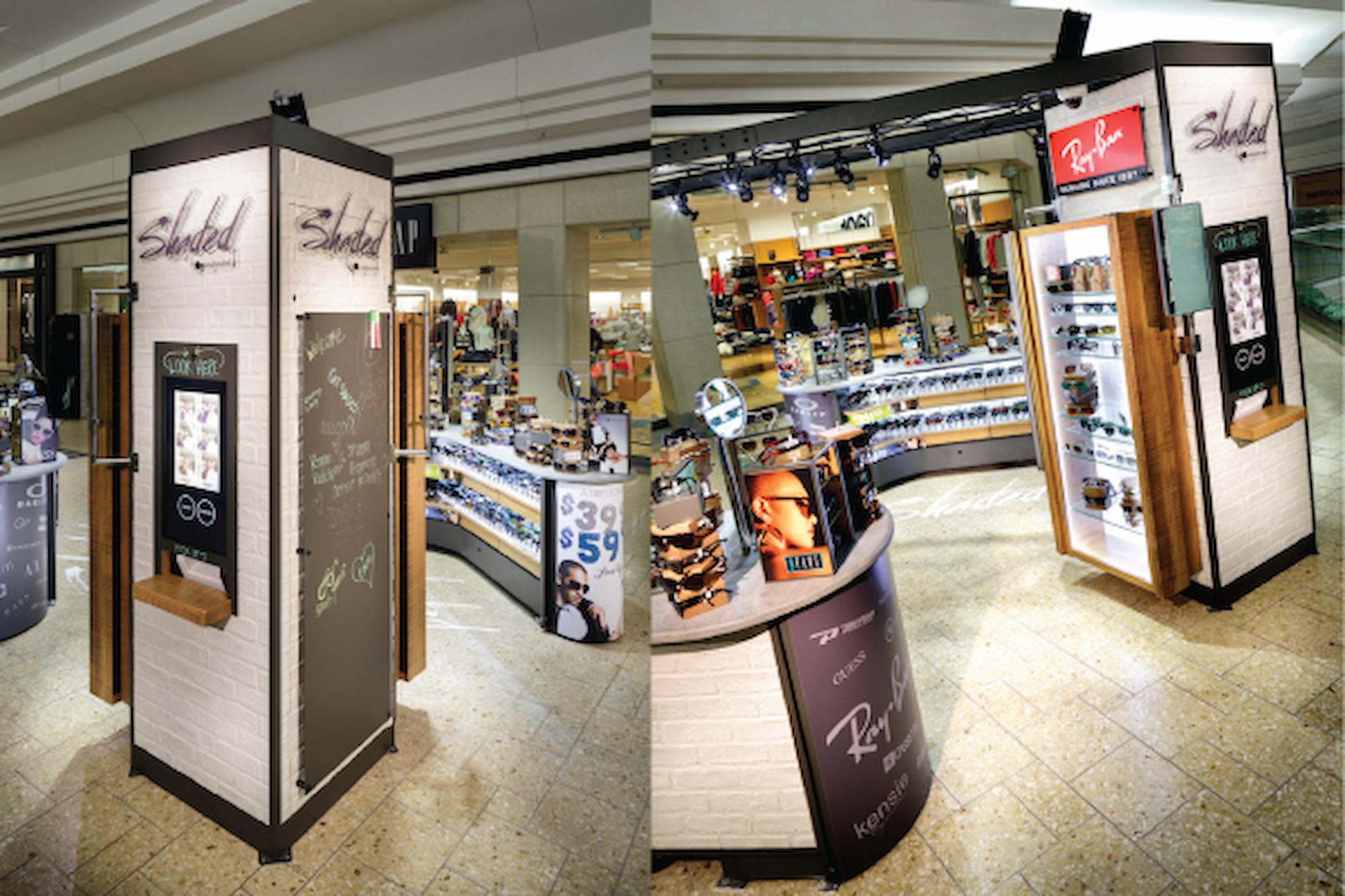
Every retail premises can do so much more with their space than simply fill it with products and jam a till in somewhere near the door. Almost all of them do. But to compete with all of the slick, well-designed superbrands who are colonising the high street, the smaller retailer has to do more than ever before to make his or her space look good.
It’s not only about displaying products to their best advantage while installing effective and attractive advertising throughout the store: there is also a larger concern, namely branding. What does your store say about your business, your products and your brand? Its first job, before selling products, before even housing products, is to be your customers’ first and most tangible, convincing experience of your brand. Customers who visit a bricks and mortar store feel they have ‘experienced’ a brand in the way that online visitors cannot. This experience can translate directly into brand familiarity, trust and goodwill… as long as every store is designed with a great first impression in mind.
Looking good
One of the key principles of retail design is helping customers to move easily and effectively around the space, so that they achieve their objectives without becoming frustrated, while at the same time maximising their exposure to individual products, advertising and promotions. The science of retail design is built around footfall, getting customers moving in the door and towards the point of sale in a way which is simple and satisfying but which takes them past multiple displays, exposing them to rack after rack of appropriate additional purchases before they reach the tills. One of the true tricks of the trade is gathering products and product ranges into discrete spaces, divided from the rest of the premises by retail furniture and display units. This technique is called ‘zoning’.
Down to business
Zoning requires a nuanced understanding of the customer’s journey from door to door, including their objectives for their visit and their expectations of the experience. To start, create a customer ‘narrative’ which describes a typical visit. Consider where customers enter, their usual path and their actions before exiting, and map that journey in ten zones or fewer: by zone ten, they should be at the doors, ready to exit the premises. Remember, the journey won’t describe every possible permutation of a customer’s visit: it should deal with a simple, typical and successful transaction. Use your list of zones to see your premises through a customer’s eyes: photograph the scene they see as they enter each zone, and use the image to consider how the things they can see help them achieve their objectives.
Use retail furniture and display technology to establish each zone and eliminate confusion, and use lighting to create the appropriate atmosphere for every space. We may need direct, bright crisp lighting to accomplish tasks which require fine motor skills, such as reading, writing or counting out change, but we’re hard-wired to prefer warmer, more indirect lighting when making decisions. Zones help managers to comprehend the customer’s journey, ensuring an optimal interaction at every stage and bringing customers to the till calm, content and satisfied with their experience.
Author bio
The author is an experienced retail worker who writes dispatches from the shop floor on all areas of the industry, including careers and training, customer service, human resources and retail design.
She often visits www.displaydevelopments.co.uk to find out about the latest advances in retail display and design.


